Redesigning the UI of a hotel management system
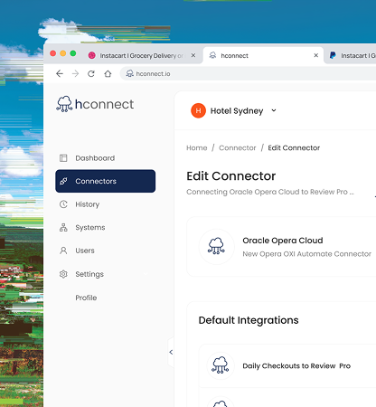
hconnect is an Integration Platform as a Service (iPaaS) for the hospitality industry that helps hotels move and synchronize data across multiple systems. As the platform grew, its interface struggled to clearly present complex integration data. The founder reached out to me to redesign the interface using the Tailwind design system. His goal was to modernize the product and create a more professional user experience. Over two weeks, I worked closely with the founder to deliver a cleaner, more structured UI that makes system data easier to understand and manage.
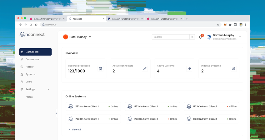
hconnect is a data-heavy product. Users rely on the platform to monitor integrations, manage system connections, and ensure that information flows correctly between different hotel systems. However, the existing interface made this work harder than necessary. Several issues limited usability and clarity.
- The platform handled important integration workflows, but the visual design felt outdated and did not reflect the sophistication of the product.
- The interface did not consistently follow the Tailwind design system. This lead to inconsistent components scattered all over the platform
- Because the platform presents a large amount of technical information, small layout issues quickly compounded into a heavier cognitive load for users.
The redesign needed to solve these problems without disrupting the workflows that users relied on.
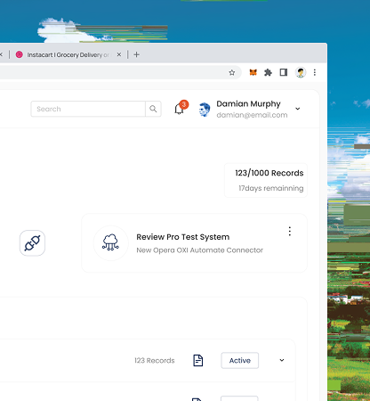
The final redesign introduced a modern, structured interface that makes integration data easier to understand and interact with.
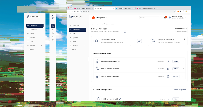
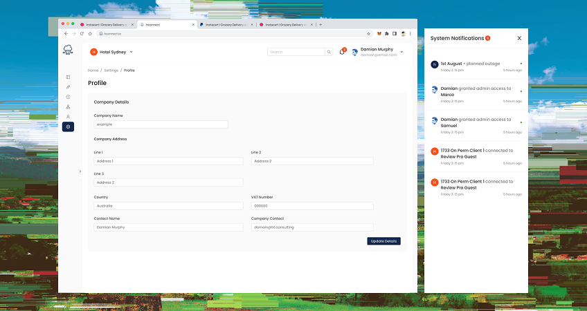
The redesign helped modernize the product while preserving the workflows users depend on. By introducing stronger hierarchy, clearer layouts, and consistent components, the interface now communicates complex system information more effectively.